New Cityscapes: San Francisco
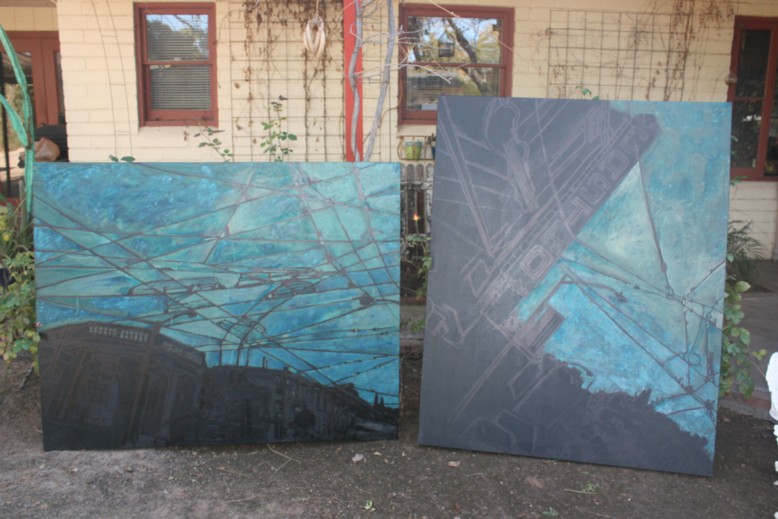
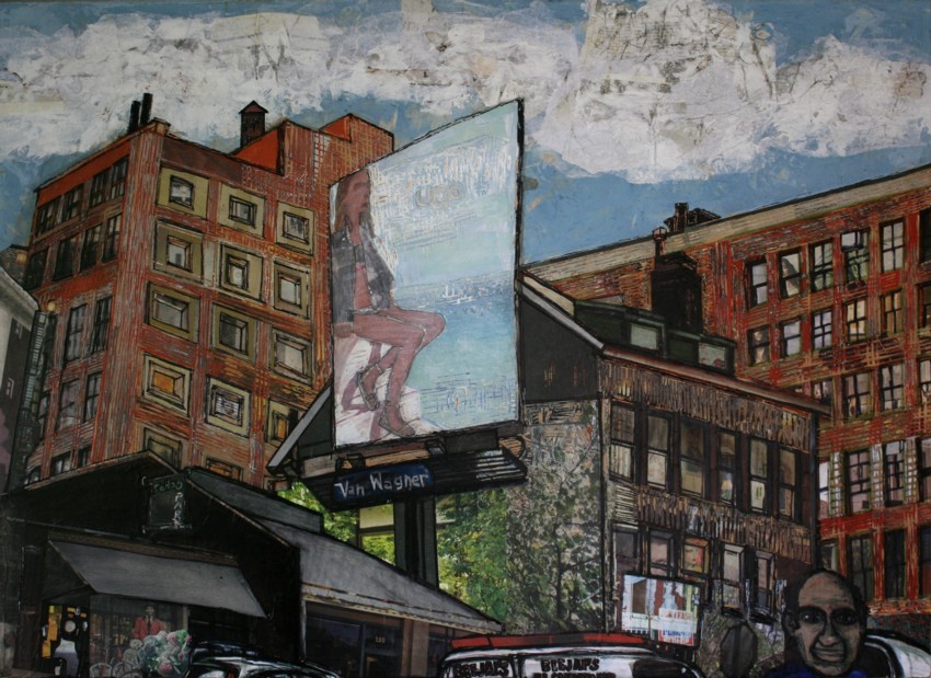
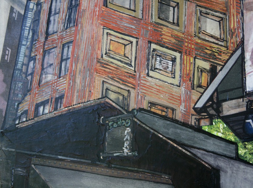
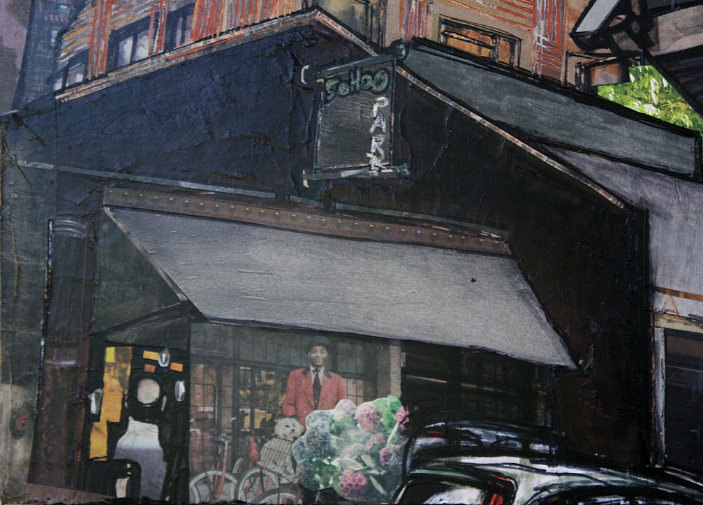
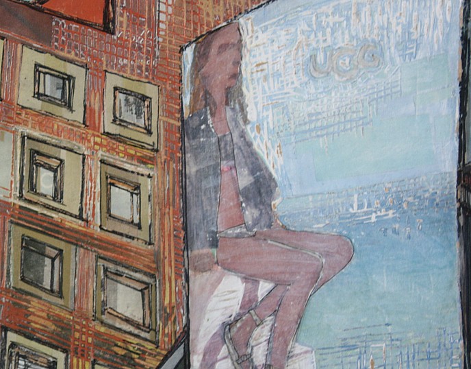
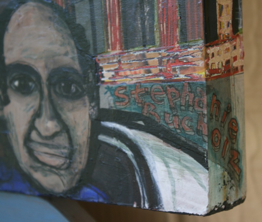
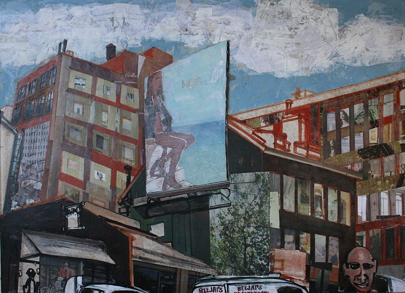
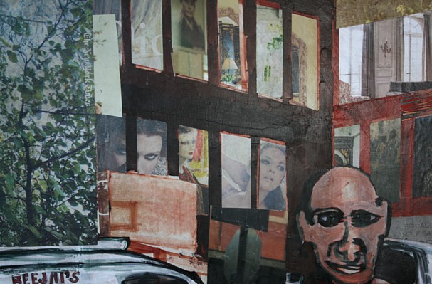
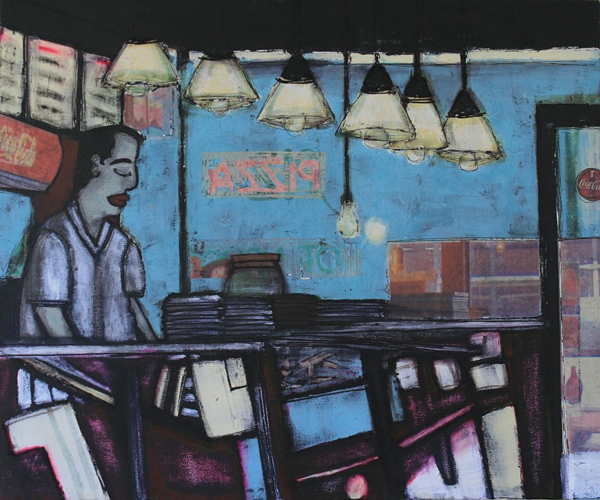
Started these almost immediately after my November weekend in San Francisco. I put aside everything else I was working on, just wanting to dwell there a bit longer. Working fast and loose, not getting too careful. Could be done this month.
62 Prince Street
I brought this painting to Art One yesterday. It may have a buyer already, a really nice guy who lives in West Chelsea and if he buys it he’s taking it back with him—guess how much I love THAT!
You can see some of the progress in earlier posts here and here.
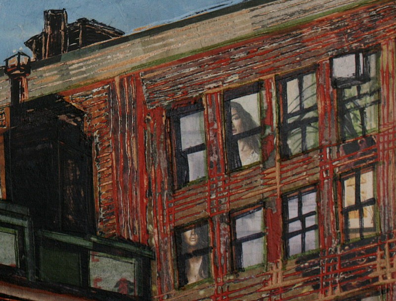
It’s marker, acrylic paint, modeling paste, and clippings from The New York Times on wood panel, and I carve into it with a linoleum cutter. The carving is a little easier to see in the detail photos (detail 6 especially):
Gross
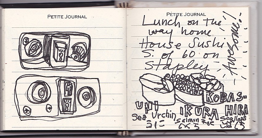
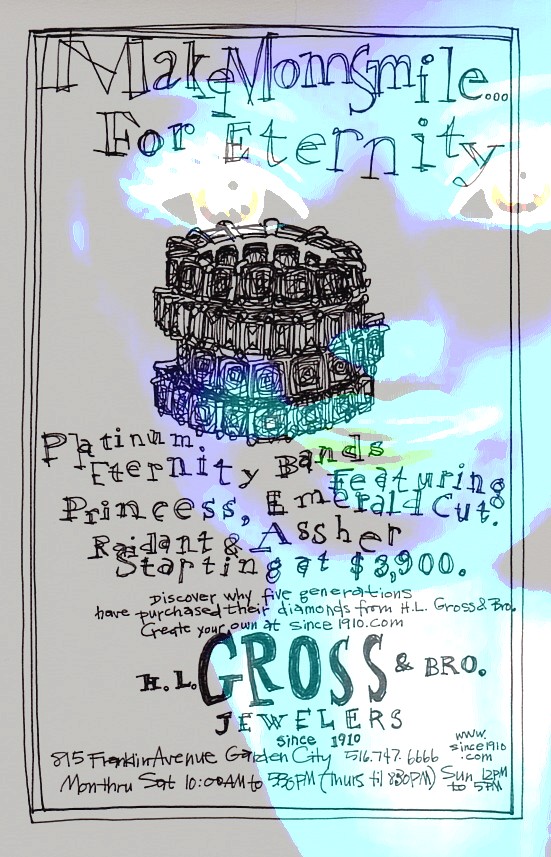
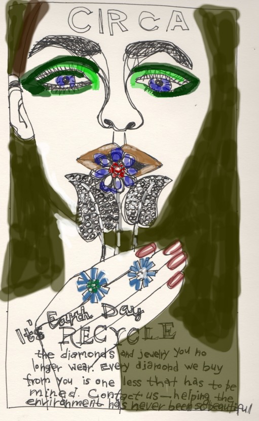
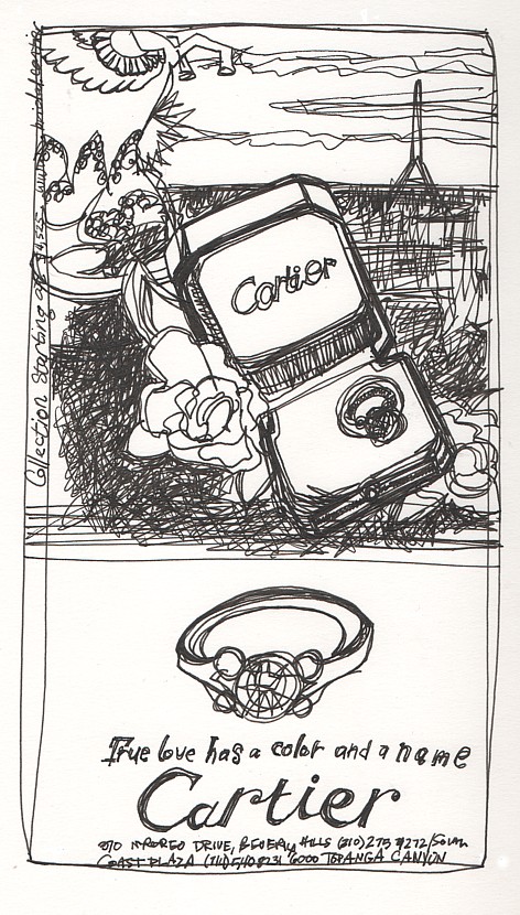
I’ve been doing these drawings of ads and obstinately not explaining anything. But then I get annoyed when other people do that. So here goes.
The drawings seem like parodies which is kind of the point because they are are in fact word-for-word captures of real ads from the front section of the New York Times. I’ll skip the speech about ads for $40,ooo-lapel pins and watches that cost more than I’ll spend my whole life appearing right next to stories of the starving, homeless, and otherwise destroyed people of the world—I’m far from the first to comment on all that.
What strikes me about the ads is the text, how creatively (or uncreatively) they go about justifying such useless purchases. I think about the designers and copy writers and I wonder if they believe in the value of the jewelry or if they know the only reason it has any value at all is because enough people agree that it does. I also wonder if they think about the company their work is going to keep—their hard day’s toil clouded with the torture, terrorism, corruption . . . In any case, basically their job is to sell pretty things to people with money to burn, which has to get tedious just like everything else, and I feel as though once in awhile they must stop caring WHAT the ads say and they figure who even reads them anyway.
And who does? Beyond a headline or two. They’re mostly predictable and boring, follow the format and the rules. But then once in awhile it’s like someone went to sleep:
Make Mom Smile . . . For Eternity.
Special nod to the campy use of ellipses. . . . Wait, am I being trolled? You have to admit it’s a mite closer to the Saw series than your traditional Mother’s Day. Do these guys wish they were making movie posters instead, and they’re having a little fun here?
Let’s say yes. The movie, Gross, is a thriller about people exiled to an alternate reality, out of touch with what it is to be a human being, buying buying buying and never getting happy. Prisoners of shallowdom, of the perpetual black psyche, and equipped with an awareness too vague to do any more than suffer wanly about it. In the style of Tommy or A Clockwork Orange. Look, there’s even a 666 for the hint of a sinister twist.
It’s a small thing, jewelry, in the bag of egregiousness that is our polarized world economy, but it just offends me so much. Truly, it is gross. What are my little drawings supposed to do about it? I don’t pretend to think they can do a thing. But I have to put them out there just in case.
Here’s another take—me playing around with the “Effects.” Yes, I used filters. But I did it ironically:
Faux pas aux deux
As much as I’d like to, I can’t finish a drawing every day or even every week, def not a painting. I think about doing one of those “Drawing a Day” things but 1. It seems forced. 2. I get bored with those so I’m pretty sure other people would get bored with mine, including me. 3. Like I need another daily chore.
So for now get this old drawing I found in an envelope addressed to Ann, my almost sister-in-law from decades ago. I met up with her once in Washington, D.C. She bought dinner even though there were five of us and she was on a teacher’s salary. The others were the younger sister and mom (they all lived there) and my coworker (we were at a conference)–and we should have paid or at least put ourselves on our expense account. This is one of those dumb things that bothers me once in awhile.
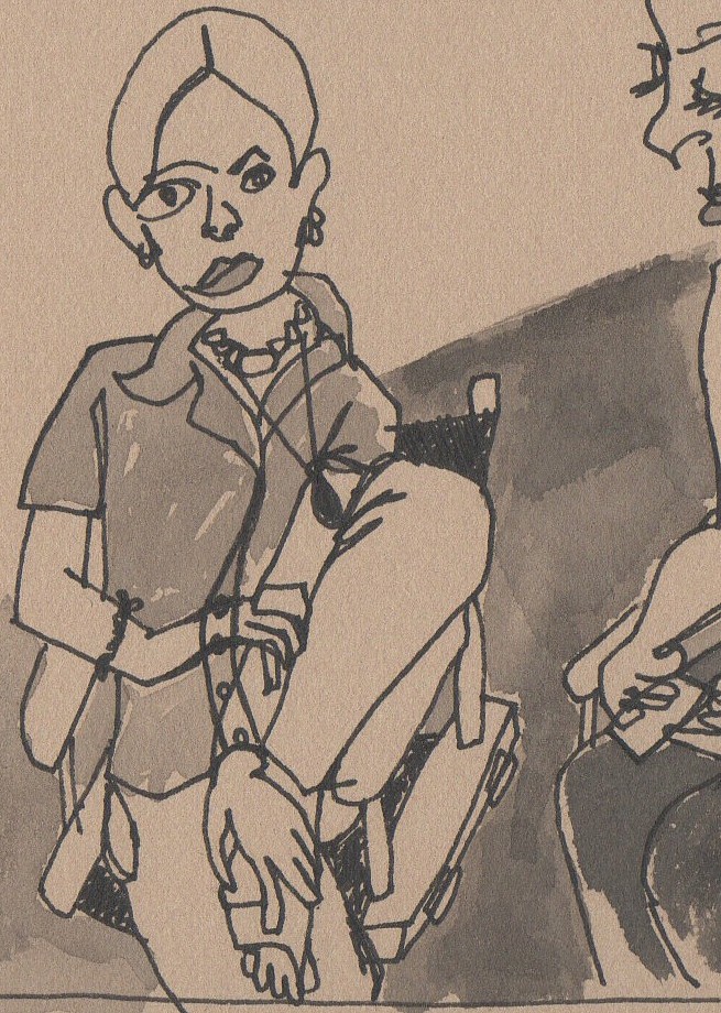
We exchanged addresses and I fully meant to write. Look, I even did this little doodle for her. I was working my shift at the co-op gallery in Flagstaff, where I lived.
It contains my fellow artist/shift coworker (right, also working on her stuff) and her daughter. I was trying to practice drawing more, especially people. They were sitting nicely still, and I loved the fluid, relaxed posture of the daughter.
It was just to say Hi, Ann. Nice to see you. Thanks for dinner.
Never wrote it. Never sent it. Faux pas aux deux.
Bethesda and the Boathouse
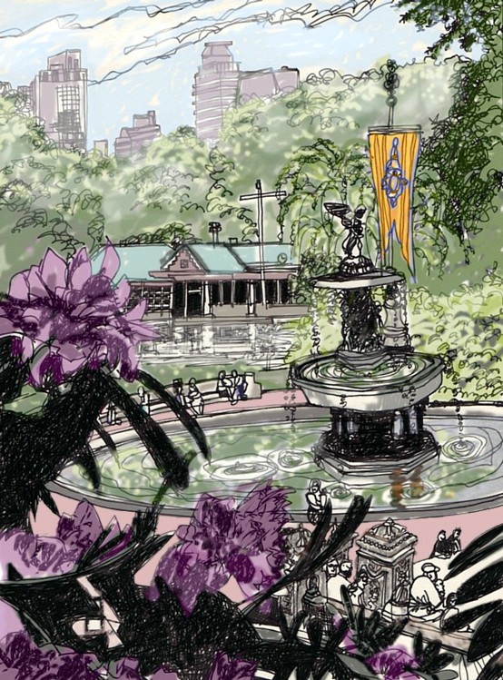
One of my favoritest spots in the world, Bethesda Fountain and the Boathouse, Central Park, Manhattan.
Some interesting things I learned about Bethesda Fountain when I looked it up on the internets:
- It’s called Bethesda Fountain. That’s one of those, “knew that once, forgot, will probably forget again” things for me.
- It was the first ever commission from a woman, Emma Stebbins, for a major piece of art in New York.
- Emma was a lesbian who was born in New York but moved to Rome where she studied art and lived with actresses. This was in the 1860s and 70s.
- In her picture on Wikipedia she looks like Princess Leia as Mary Todd Lincoln.
- Tony Kushner mistakenly said in the first edition of Angels in America, in which the statue makes a cameo appearance, that she commemorates Civil War dead.
- Ironically the truth is far more apropos to his play because what she actually represents is a water-blessing, healing-power-giving angel from the Gospel of John, and her pose depicts the act of blessing the water below her, presumably giving it the power to heal.
To Steven: Happy Anniversary! Love, Gus.
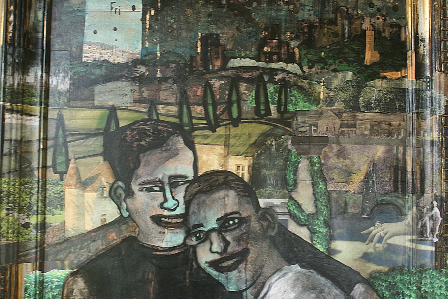
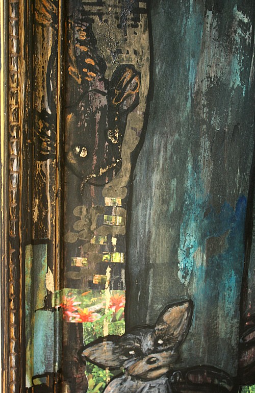
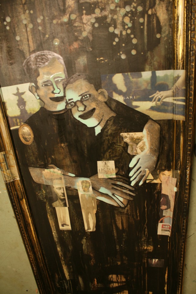
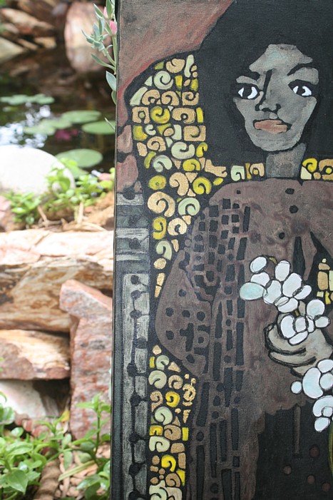
For about the past five months I’ve been working in secret on a painting of my friends Gus and Steven, an anniversay present from Gus to Steven.
Per Gus’s specifications I tried to keep some of the original image peeking through. He had seen some of my other painting-over-old-paintings and liked that aspect in those. He had an impressive knowledge of my work and had clearly spent some time looking at my web site and blog, which is a super great way to make me feel all happy and good. He didn’t want to steer me too much but there was some very helpful direction in the things he described that he liked.
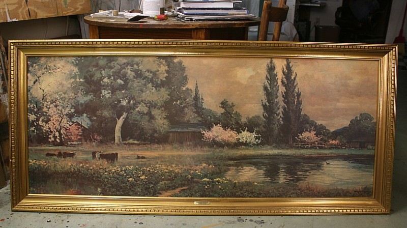
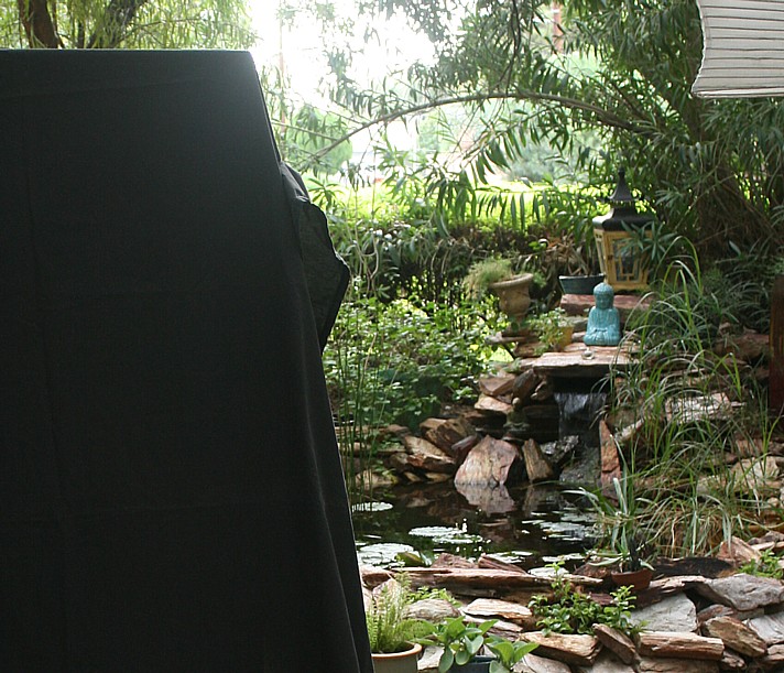
Also he had an old framed painting that once belonged to his aunt that he wanted me to use. He didn’t want to hang the image anymore, but he didn’t want to just hide it away, either. He sneaked it over in April and I promptly covered it in black.
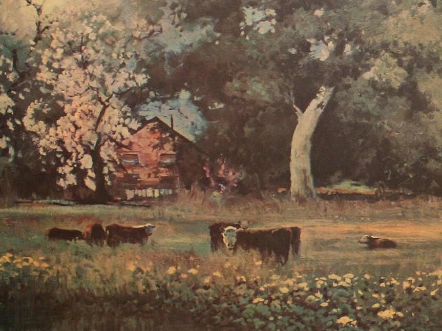
Not a bad painting, that. (Actually a print of a photo of a painting on board.) I especially enjoyed this section with the cows and the fairly impressionistic shrubbery and the sort of possessed-looking barn:
Here it is in progress, flat on its back on the floor so I can puddle and drip paint on it:
I finished a little late but Gus and Steven were out of town for their anniversary anyway so Gus said it was fine. It’s always good to be able to finish something with no pressure. Finally I was able to text Gus, “Et voila!”
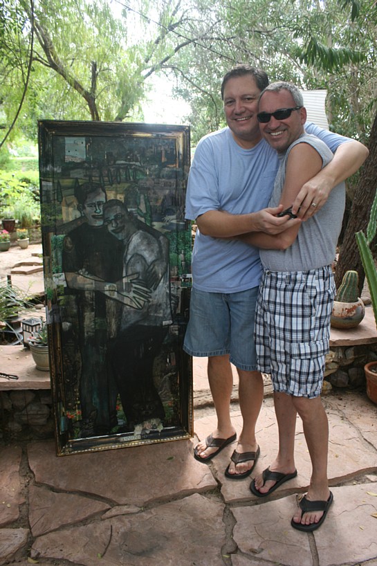
They came by to see it for the first time and pick it up Saturday. Gus texted me they were on their way after running some errands and Steven had no idea. I tried to act all surprised to see them but I’m a really bad actor and Steven had sort of figured it out by then anyway. So I dispensed with pretense and walked them out to the front patio, the prettiest place by far to unveil a painting.
Of course I worried a little they wouldn’t really, really like it like I wanted them to. I didn’t think they would hate it but I wanted them to love it. They said they did. They seemed for real.
True story. Happy ending.
Met 8-8-04, married 8-8-08
Happy Anniversary, Gus & Steven!
(More) Old Stuff
Working on new stuff. LOTS of new stuff. MUCH NEW STUFF COMING SOON!
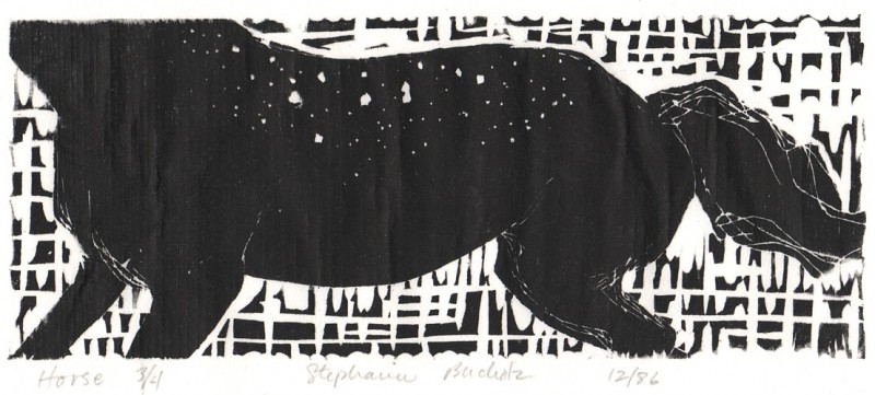
Meanwhile, enjoy this woodcut of a headless horse from 1986*. Why headless? Because horse heads are really hard to draw, duh. At least I imagine they are. Clearly I am not the one you should be asking.
*Holy cow, that was twenty-six years ago. I was a wee bairn, a guppy, a blind and meandering spawn! So let’s cut me some slack, shall we? I know I’m going to.
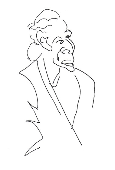
Why is this man angry? Because he sees me drawing him.
I drew this angry dude on a card and mailed it to my friend Reg in the early 90s when I lived in Tempe and he lived in L.A. He just came across it in his stuff. Inside were more drawings (copies), and me saying I had taken up doodling people at the Coffee Plantation that used to be on Mill Avenue. Most of them didn’t notice or pretended not to, I said. A few, like this guy Frank, came over and looked at the drawings and chatted and approved.
But Angry Man here, when he saw me drawing him, “took off his glasses and thrust his face toward me and scowled at me. Then he got up and walked toward me.”
I have a vivid memory of how pointedly he placed his jam knife down, rose from the table, and stomped fast toward me, all the time staring at me, pinched and furrowed. Like he’d been looking for a fight and here it is.
I stayed really calm and pretended not to notice. I moved my hand over his face on the paper and started drawing the t-shirt in the window behind his chair.
This actually worked. From over my shoulder Angry Man saw only the drawing of the shirt and retreated quietly back to his corner.
“Yikes,” I wrote. “Doesn’t he look mean?”
What would I have done if Angry Man had demanded to look under my hand? If he yelled at me in front of all those people? Crumpled like an already-crumpled piece of paper, that’s what.
Here are some of the drawings:
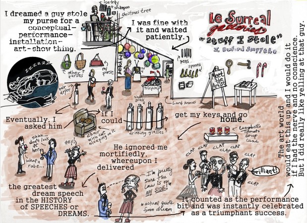
Points of Return: Fatal Attraction
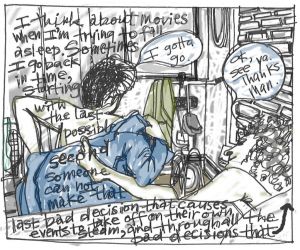
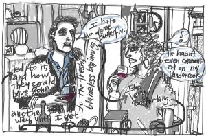
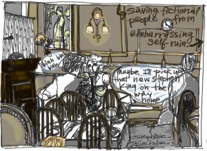
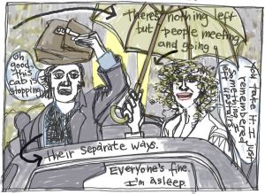
“Points of Return: Fatal Attraction” is the first in a series of comics about movies. Or maybe it’s the only one, who knows. Can’t tell yet.
It’s about this thing I do that helps me go to sleep although that’s not why I do it. Who knows why I do it. I am how I am and I’ve stopped trying to be much different. But it does knock me out, so I don’t worry about it a whole lot.
If it’s a little too hard to read, skip to the next post where you may read it with relative ease panel by panel.
